 Text
Text
 Badges
 Icons
Icons
 Buttons
 Animation
 Banners
 Menus
Menus
 Design
home > page_design
PUTTING IT ALL TOGETHER
 Web 2.0 Web Design Web 2.0 Web DesignCoyote Clips© | |||||
|---|---|---|---|---|---|
| Headers and Menus | |||||
| Professional Portfolio | 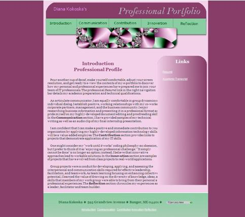 | web 2.0 header with an image map navigation coded with GIMP®. The background colors and gradient backgrounds are addedto the body and to individual divisions. | Site | ||
| Cascading Style Sheet Tutorial
Page Layout Design by Alexander Webster | 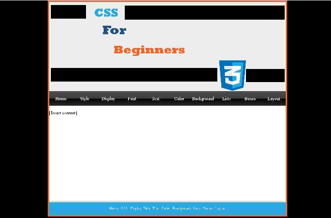 | web 2.0 header and a dynamic navigation bar. The footer is a "sticky footer" that displays after the content or displays at the bottom of the screen if the content is less than one screen high. The Menu background is a 1 pixel x 60 pixel image css_btn.png
CSS Logo | PDF PP | Site | |
| Example of My GIMP Portfolio Site Front Page | 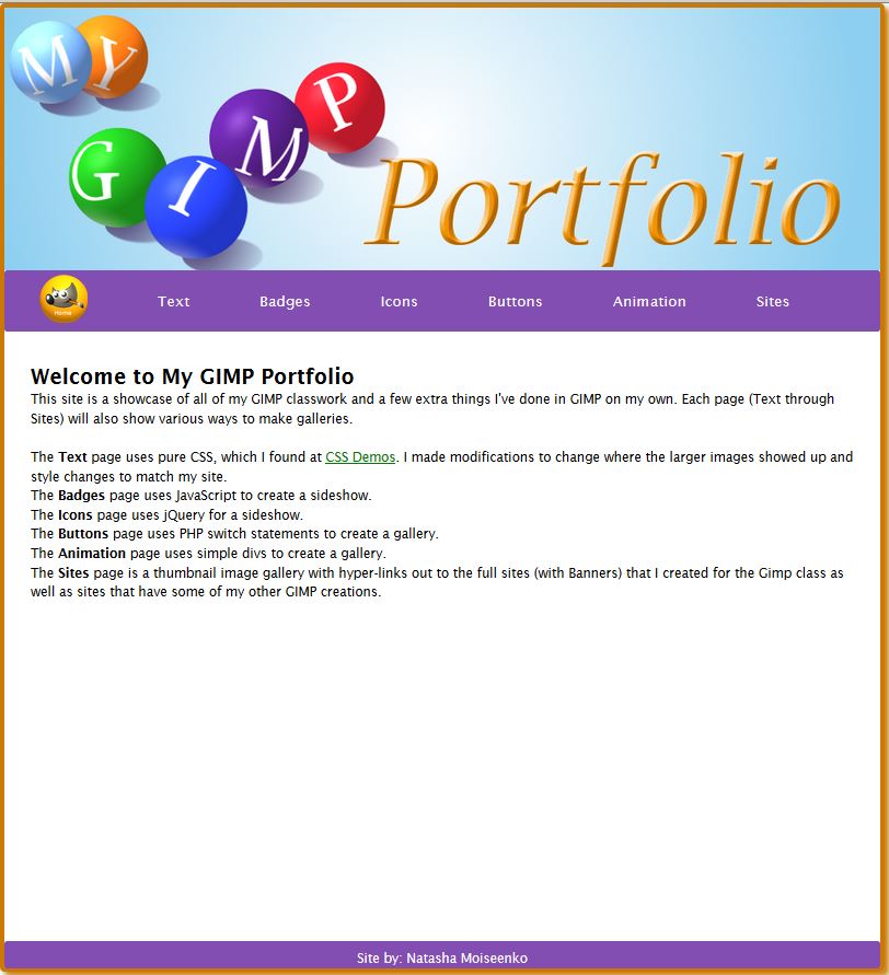 | PP | |||
| Example of My GIMP Portfolio Site Gallery Pages | 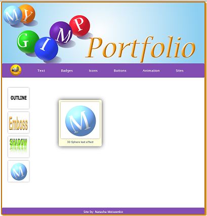 | This gallery is developed using purely HTML and CSS Feel free to visit the text gallery at Text Gallery | |||
| Another Example of My GIMP Portfolio Site Front Page |  | The front-page navigation is created with HTML and CSS (credit for navigation layout to Dustin Davidson (CIS231 student). | |||
| Another Example of My GIMP Portfolio Site Gallery Pages | 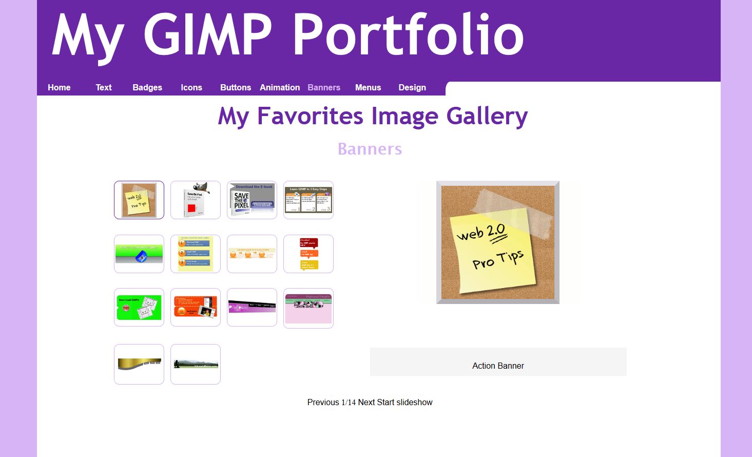 | The Gallery pages are created using jQuery Picture Slides. If you are taking CIS231 JavaScript or are familiar with jQuery, please feel free to try this plugin. Feel free to visit the completed gallery at My GIMP Design Portfolio. | |||
In the last chapter of his book, "Save the Pixel -- the art of simple web design," Ben Hunt sums up the web design process in "Save the Pixel in a Nutshell." His 12 steps lay the foundation for designing a award-winning web site.
Before you "put it all together," you want to be sure that the your Web site is designed for on-the-go mobile users as well as traditional desktop viewers.
If you have recently taken a class in Web design and development, you are probably familiar with the two most popular Web layouts: Fixed-Width and Fluid. (Definitions from Blended HTML and CSS Fundamentals by Bojack and Scollard).
Fixed-Width Layout
A layout in which the column widths don't change when the browser window changes size.
Fluid Layout
A layout that expands and contracts so the contents fill the entire screen width.
But what do you know about adaptive layouts? Adaptive layouts use a design approach called Responsive Web Design (RWD), to respond to size of the viewport and display the content optimally for the user's media device -- be it a tablet, I-Pad, or smartphone-- So if you are viewing the Web page on a PC, you get the PC version of the Web site; if you viewing the site on a mobile device, you get the mobile version of the site.
Responsive Web Design (RWD)
In CSS2, some of you may have used media types. For example, you might have used different styles to created a printed version of your Web page --perhaps changing the text color to grayscale when printing. Media queries in CSS3 are very similar. Rather than looking at a specific cdevice, they detect the capabilities of the device, such as
- Width and height of the browser window
- Width and height of the media device
- Orientation of the display
- Viewing resolution
If the viewer's browser supports media queries, you can define CSS styles that checks to see if the viewer has a small device, such as a smart phone or a medium device, such as an I-Pad or tablet, and apply a specific layout for that device.
Check Natasha's Travel Site on any mobile device to see if the media queries detect your viewport and serves up the correct styles.
The quick and simple, "CSS-Based Background Blend" tutorial will walk you through the steps of creating gradient images in GIMP®for the body and content sections. You can use this in your final Web design; however, CSS3 already provides these techniques, but not all browsers support them fully.