 Text
Text
 Badges
 Icons
Icons
 Buttons
 Animation
 Banners
 Menus
Menus
 Design
home > buttons
Pixel Perfect - Web 2.0 Buttons
BIG is web 2.0. And buttons are no exception. Whether you are designing a call-to-action button to prompt the user to download a program or purchase a product or a navigation menu to guide the user through the pages in your web site, the following tutorials boast the latest in web 2.0 design trends.
 Web 2.0 Buttons Web 2.0 ButtonsCoyote Clips©
| ||||
|---|---|---|---|---|
| Call-to-Action Buttons | ||||
| Buy Now or Add to Cart |  
| Rounded rectangle with white arrow | video | |
| Download |  | Rounded rectangle CD Icon and download arrow | video | |
| Striped Button | 
| Web 2.0 download button with a striped pattern fill with coordinating shadow and embossed text. | video | |
| Glossy Button |  | Glossy button with rounded corners, a drop shadow, and a blur effect | video | |
| Navigation Buttons (the xhtml and css for all navigation menus will be coded in the Menus section) | ||||
| Simple Menu |  | Simple navigation menu with gradient buttons and a vertical line divider | video | |
| Menu with Icons |  | web 2.0 navigation menu with both text and icon links | video | |
| Button Background Images |   | A button background image that will be used as a background and hover image for a CSS styled navigation menu | video | |
| Horizontal Navigation Menu with Rounded Buttons |  | Horizontal Menu with dynamic rounded buttons with a default and hover state | video | |
| Dynamic Navigation Menu with Position Arrow | 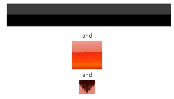 | Fire Gloss navigation buttons with a gradient black background and a black navigation arrow | video | |
| Horizontal Gradient Navigation Menu | 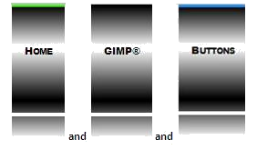 | Gradient navigation menu with hover and current image buttons | video | |
| Horizontal Navigation Menu Reflective Hover Buttons | 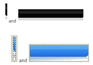 | Horizontal Menu with reflective hover buttons | video | |

Call-to-Action Buttons
The primary call-to-action button should be the most noticeable element on the page. Within reason -- the BIGGER THE BETTER. as long as the button empowers the content, not overpowers it. And how does a button get noticed? Buttons with round corners, bright, eye-catching colors, and bold in-your-face text scream "Click me!, click me!, click me!"
But how does a designer entice the user to "click me"? Wait! I know what works for me... "FREE" Borrowing from a popular radio commercial, Free is good; Free is great; Free IS awesome!"
Is there anything else that you should know about call-to-action buttons? Location is key. Designers agree that buttons should be placed above the fold, which simply means that they should appear on top vertical half of the screen and should have plenty of whitespace separating them from the content.
Navigation Buttons
Both horizontal and vertical navigation bars in Web 2.0-centric sites are designed along a common theme -- usability! Web page visitors stay on your site longer if it is easy to find what they are looking for. Your goal, and an explicit goal of web 2.0, is to guide the user through your site in such a way that the user knows that he or she is in the right place.
Ever notice that many of the 2.0ish buttons have a unique blend of Web 2.0 colors. Instead of creating the blends yourself, you can download 30 pre-made gradients from Ultimate Web 2.0 Layers Styles for GIMP.
Do you remember from your html coding that a link can be styled for four different states?
| State | Description |
|---|---|
| link | The link before it has been clicked |
| active | The link when the mouse button is being presed |
| visited | The link after the page has been visited |
| hover | The link when the mouse is hovering over the text |
Web 2.0 designers take advantage of these states to make the user feel at home. Notice on the navigation bar above, when you open the Web site for the first time, a blue bar displays above the "current" page button -- the Home page. As you move your cursor over other menu buttons, a green bar displays above the button. When you click another button (such as the Badges button), a blue bar displays above the NEW "current" page. This dynamic, "You are here!" imagery helps to establish a simple, easy-to-follow navigation scheme that makes the user feel comfortable navigating the site.
The heading of this Web page, "Pixel Perfect - Web 2.0 Buttons," refers to a balance of image quality and file size. Although each of the buttons in the Navigation section are designed as complete buttons, many of them are saved as 1-pixel wide images that are repeated horizontally as a background image using a combination of html script and css formatting.